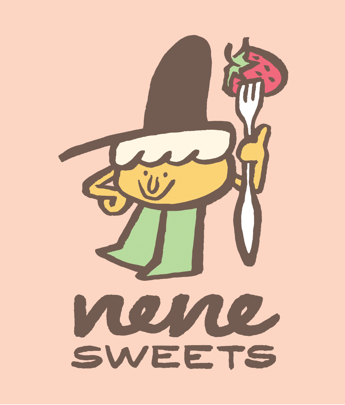
Nene Cafe logo and character design
A cafe in Tokyo that specializes in farm-fresh strawberries and shortcake contracted me to create their logo and character for use in their shop and on their products. The reference images were mostly 60s and 70s product design featuring character illustration and hand typography. After drafting and entertaining multiple possible directions for the main character and overall aesthetic, as well as the logo text, the client and I finally dialed everything in and decided we’d reached the…sweet spot. I utilized my fude-pen to do all of the line work, as it allows quick, confident mark making that imbues a bit of life and charm. In efforts to adjust the logo text to feel more consistent, everything turned out too stiff and didn’t “feel” right; consequently, it was a great reminder that trusting the hand to make the right marks sometimes beats efforts to “correct” things after they’re on paper. In the lead up to the color palette we finally landed on and its application in the design, we had to consider the multiple—and almost equally appealing—alternatives. Color is always an enjoyable challenge.

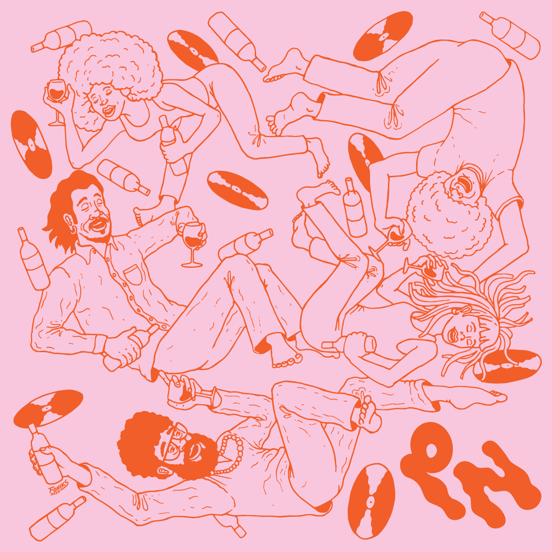
Paradise Nature promotional design
Promotional illustration for repeat client, Paradise Nature, out of Nagoya, Japan. Characters and alternate logo mark were created specifically for this natural wine shop and subscription service. Music and record culture are central to the brand and the events it is involved with, so I wanted to capture that floating sense we can all feel when we’re lost in the mix in on the dance floor, or at home, with good people and tunes.

Eliot Lipp "Kona" b/w "Silver Bass" 7" jacket illustration and design
One of my longtime record label clients, Bastard Jazz in NYC, reached out to have me do the album art and design for a 7” that artist Eliot Lipp was releasing via their label. After listening to the tracks, and having a chat with both the label head and the artist himself, a light, breezy direction for the art was clear. A lighter color palette with less contrast than I typically use—but am no stranger to—was agreed on, and I proposed adding a bit of the city pop influence with the floating color shapes and “splatters,” similar to the much cleaner early computer graphic styles of Japanese artist, Eizen Suzuki. At first I suggested the idea of riffing on one of the cheap tourist T-shirts that could be found throughout the US in the 70s-90s, and then I thought it would be more interesting if we took the idea of a windsurfer and had the character surfing off the shirt itself instead of being a flat graphic. While the shapes and “splatters” ended up making the cover a bit busy, we opted to keep them for the back of the 7” jacket, which worked out nicely. As usual, all illustration, design, and layout is done by me.

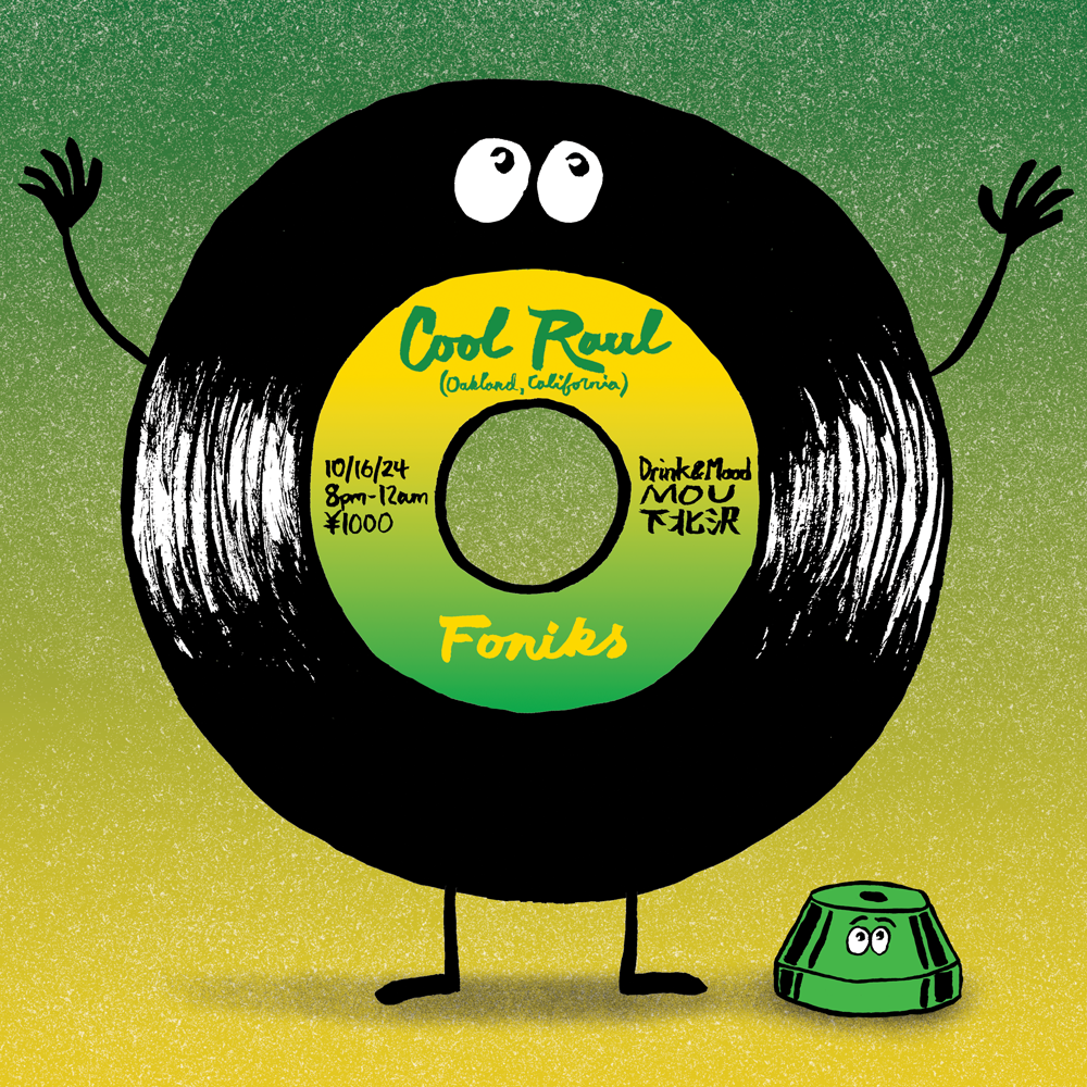
DJ Flyer
Flyer I made for a DJ event at one of my favorite bars, featuring a record digger from Oakland, CA who brought the rarest-of-rare funk 7”s that leaned into the best parts of left field. Anthropomorphic records and adaptors, yay!

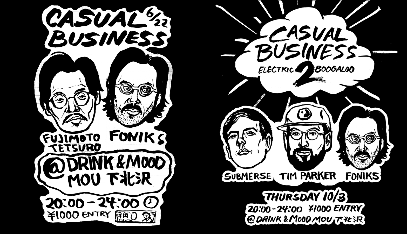
Casual Business Flyers
While I often create more refined work, I also enjoy styles that are a bit looser. These flyers were created for some small DJ events I organized with some friends at one of my favorite bars in Tokyo (which closed its doors unfortunately). The fude-pen, or brush pen, that I used to create these designs is one of my favorite drawing tools, and great for work where I simply want to commit to mark making without too much fuss. Both the process and end result are always fun.

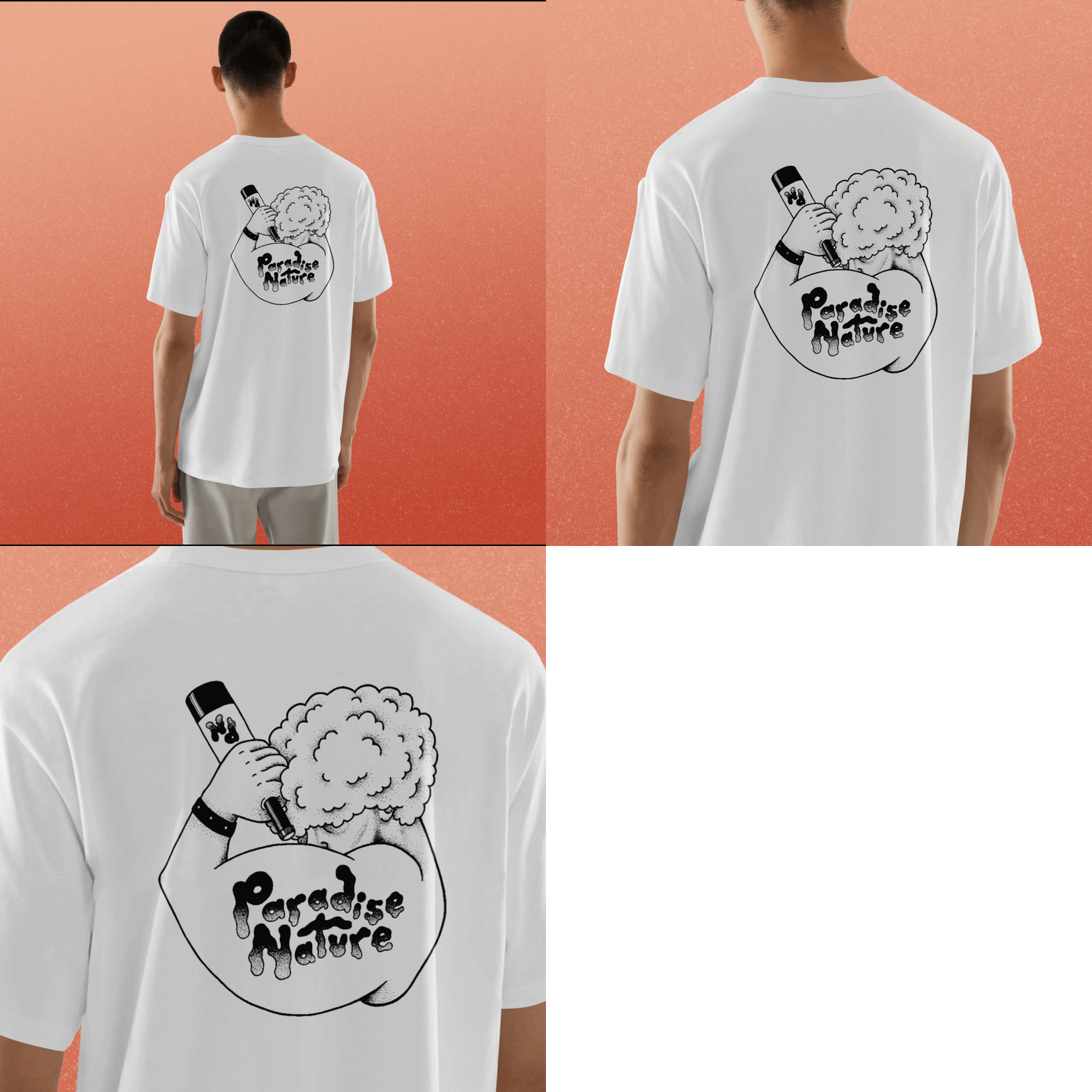
Paradise Nature Tribute T-shirt
One of my clients, Paradise Nature, asked me to come up with a design to pay homage to one of their sources of musical inspiration. Strictly for the heads, this design incorporated the logo and one of the characters I’d created for the company’s website and promotional purposes, and put it into the iconic pose from the original design. I decided to use stippling for the shading as a nod to styles from the 70s, and also because it’s simply a fun technique.

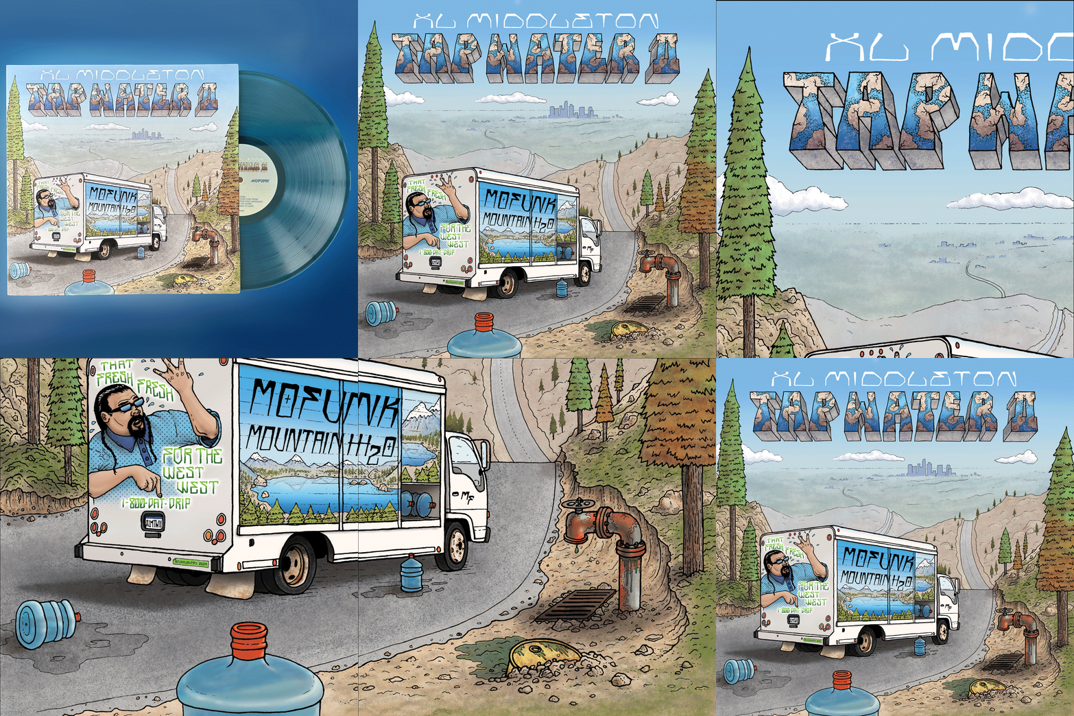
XL Middleton "Tap Water" LP cover illustration
I was really excited when XL reached out to have me create the cover art for the second installment of his modern funk classic, Tap Water. I’ve worked with his label, Mofunk Records, before and am a fan, so this was another project that was a joy to work on. We hopped on a call to discuss the idea he had in mind—a truck in the mountains outside of LA all loaded up with tainted water that was ready to deliver its payload in the city—and after getting the gist of things, I created thumbnail sketches with some different ideas of how to portray the initial concept. Of course, I had to add some humor into the mix, and proposed a version of him on the back throwing up a “W” with a tongue-in-cheek tag line for the fictional water company on the truck. I love lettering, and for the title and his name, I wanted to give a nod to some of the cholo styles that can be found around LA, along with a bit of a reference to 3D letters on 70s/80s album covers that were made to look like stone or concrete. Coloring and shading took awhile on this project, but the end result was worth the effort. Once I had it all dialed in, I was excited to share and get the green light from the man himself. The album is available on https://mofunkrecords.bandcamp.com/merch where some other album covers I’ve created can also be found.

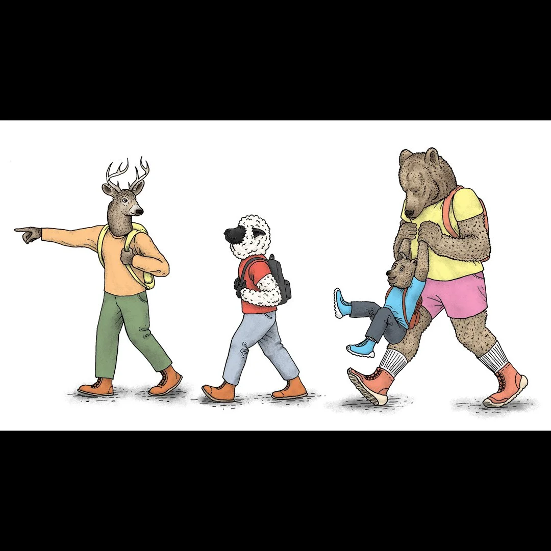
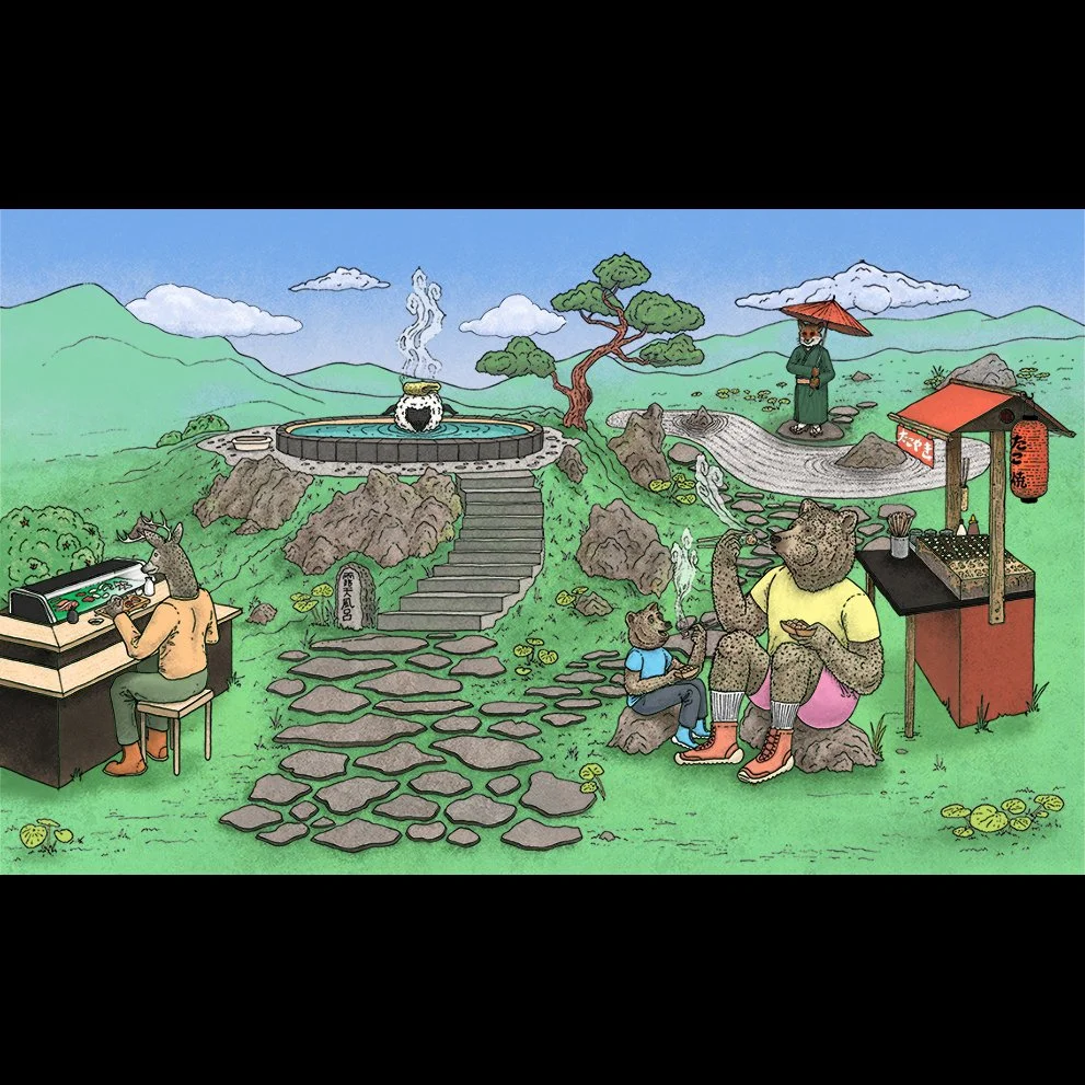
Coots Tourism promotional illustration 4
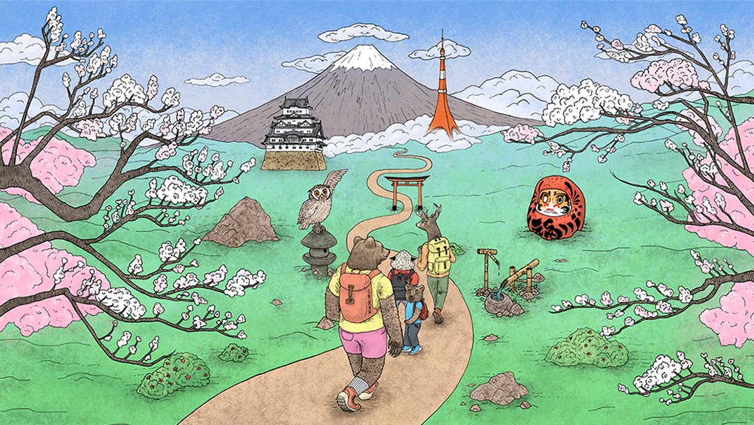
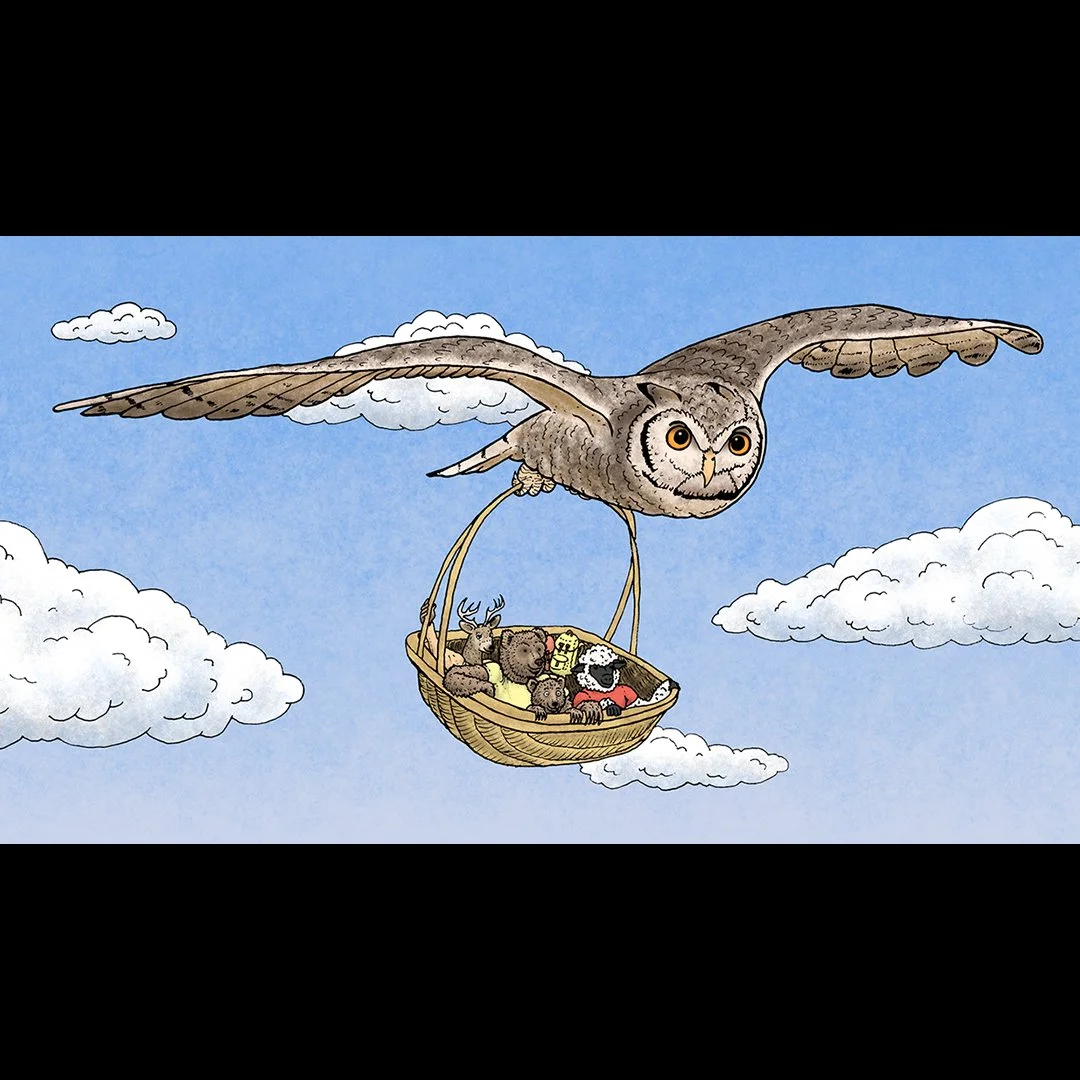
Visuals I created for a local Japanese tourism company to be used in their forthcoming website. Went with a storybook direction on this after hearing the illustrations would have animal characters going on an adventure.

Coots Tourism promotional illustration 3
Visuals I created for a local Japanese tourism company to be used in their forthcoming website. Went with a storybook direction on this after hearing the illustrations would have animal characters going on an adventure.

Coots Tourism promotional illustration 2
Visuals I created for a local Japanese tourism company to be used in their forthcoming website. Went with a storybook direction on this after hearing the illustrations would have animal characters going on an adventure.

Coots Tourism promotional illustration
Visuals I created for a local Japanese tourism company to be used in their forthcoming website. Went with a storybook direction on this after hearing the illustrations would have animal characters going on an adventure.

Resonant Mixtape Cassette Design
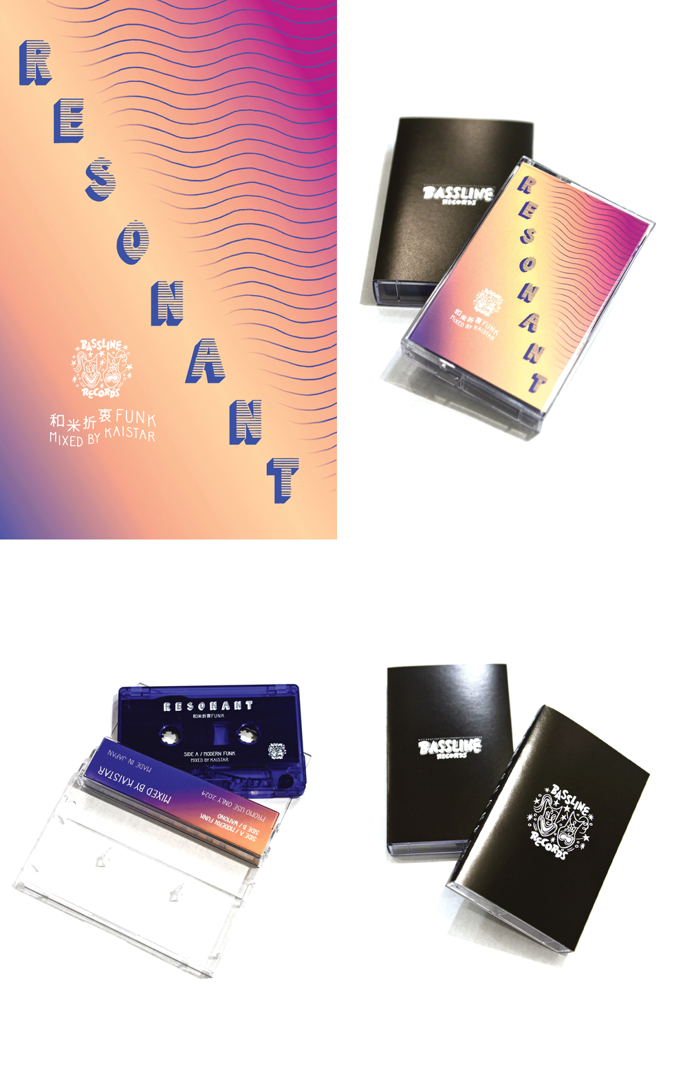
I love physical media, so I was excited to work on this project when DJ Kaistar reached out to me about working on another of his mixtapes, this time for a Japan-only release. Like with the previous project I had completed for him some years before, the title and concept were the starting points for our discussion. After he explained his idea of wanting a mix that resonated with fans of the 80s funk and City Pop he had based the mix around, I decided to take a typographic approach. The use of lines and repetition, reminiscent of text-based 80s album covers and flyer designs, was something I drew inspiration from. While the title text was based around straight lines, I utilized repeated wavy lines in the back for some more movement and a visual representation of vibration/resonance. To further play off of those lines, I had the info text on the lower left follow the same waves. Speaking on text, all the lettering on this project is hand drawn.
*Bassline Records logo and outer black jacket are not my designs; however, the jacket uses the Resonant typeface that I designed on its spine.

Donuts Are Forever 2020 T-shirt Design
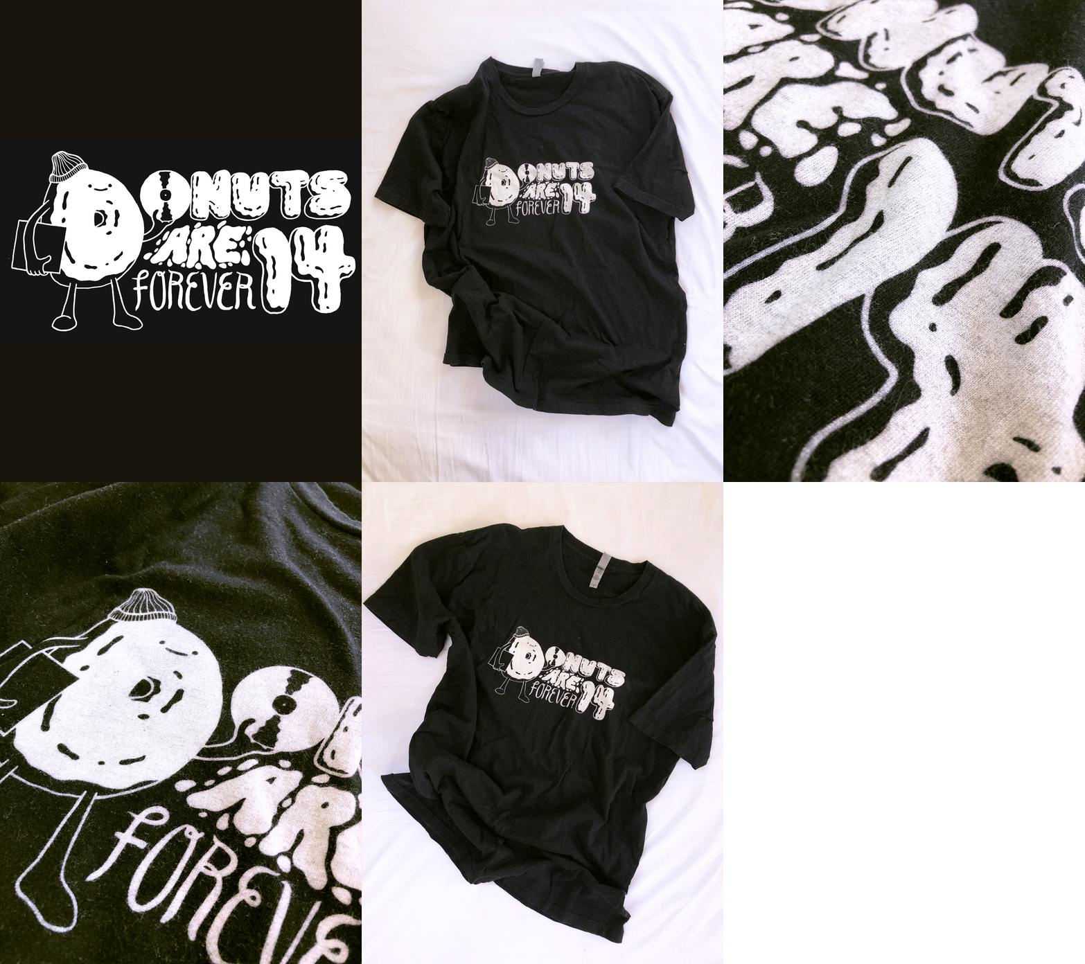
Donuts Are Forever, an events series in New York celebrating the career of famed producer Jay Dee / J-Dilla, reached out to have me create a design for their T-shirt in 2020. As a nod to the Detroit-native’s hometown, I wanted the “D” in “donuts” to be the main character. The “O” had to be a freshly-dug record pulled out of the sleeve, of course. The shirt prints came out great and overall this was another project I enjoyed bringing to life from initial sketches to a finished shirt that was sold at the event.

Casual Business MX flyer
Casual Business has turned into somewhat of an event series, and this time I brought it to Mexico City. In keeping with the looser, funky style of the previous flyers, I used the fude-pen for this design as well, and opted for some saturated colors that I’d seen used in some 80s/90s video game cover designs. Since we were going to do a live jam with drum machines and synthesizers, followed by DJ sets with more disco/funk/house, I included a nod to the more robotic elements of the night with the Robocop type helmet on a woman slurping her drink in the club. A mix of raw fun with the “sexiness” of brush script to communicate the overall vibe of the evening (which definitely delivered, and then some).

Jupiter Disco Event Poster
Event poster for Singapore-based music collective, Darker Than Wax (DTW), and their event at NY club venue, Jupiter Disco, in spring of 2022. Concept, illustration, and design by me.

Moniquea - On Repeat album cover
This is a recent album cover for MoFunk Records artist, Moniquea. The album was released digitally, on LP, and as a cassette. One of the most notable artists in the modern funk scene that’s been growing over the last decade and a half, Moniquea had a much deserved write-up towards the end of 2022 on the official Grammy website

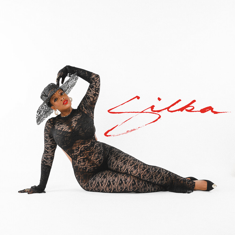
Silka - Album Art
I was contracted to do hand lettering for the title of the debut album from NY-based artist, Silka. After many pages of iterations with a Japanese fude-pen (brush pen), searching for the brushstrokes with the right feel, I was finally able to settle on a version that fit the photo and overall look the artist wanted.
While I usually go through a process of creating an entire image (sometimes including lettering) from scratch, it was refreshing to focus solely on lettering to compliment the beautiful cover photo. The icing on the cake? Having the artist express how pleased she was that I “got” what she was envisioning.

XL Middleton - Rose Bowl Motel EP (Mofunk Records 2020)
Album art designed and illustrated by yours truly for the head of LA’s Mofunk Records, XL Middleton. He asked for some funky motel sleaze vibes to match this 4-track EP of house-infused funk, and that’s what was delivered. Hand drawn on paper and colored on the computer.

Modern Funk Fest DJ Summit 2020 - Official Event Poster
Official event poster for the Modern Funk Fest DJ Summit 2020 in LA. I was super hyped when the organizers for this event contacted me. Admittedly, I was also bummed that I wouldn’t be able to witness the lineup they had.
For the concept, I thought it would be fresh to have the lineup look like a stack of cassettes, allowing me to use different hand type styles for each artist. The process of figuring out different styles and how the letters will work together is incredibly gratifying. If something doesn’t sit right, it eats away at me until I’ve solved the problem. Oh, and for my detail heads, I made sure to change the cassette player name from a popular Japanese brand to “Homy” ;) Design should be fun, right?
*Mofunk, Hobocamp, and Modern Funk Fest logos not designed by me.

High Klassified
One of my favorite DJs in Tokyo (formerly Fukuoka), Stupid Kozo, was organizing an event for Montreal artist, High Klassified (Fool’s Gold Recs), and had contacted me about making an illustration for the flyer he was creating. While I don’t recall if the event materialized (it was scheduled for late 2019 - early 2020), the project was still fun. At the time, I was visiting LA and luckily had some free daytime hours to knock the project out.
After digging through some press photos of the artist, the shot with a chihuahua in a baby holder was the most interesting, so I drew out a few versions. When I draw with the fude-pen (Japanese brush-pen), I often avoid doing a preliminary sketch; since I started using this style of pen, I’ve enjoyed the somewhat raw character that drawing freehand with it yields. After settling on a version and getting the green light to add color in Photoshop, Kozo also asked if I could add some text as well (btw, hiragana, katakana, and kanji are all super fun to draw/write once you’ve got the forms down!).

Submerse "See You Soon" - Osaka Release Event Poster (2019))
Japan-based recording artist, Submerse, contacted me to create a poster for release party of his album, “See You Soon”. He wanted me to utilize the album cover photography by Repeat Pattern, but with illustration; so, I used a fude-pen (current favorite) to draw both a version of the tiger featured on his cover, as well as some tiger stripes for the background. I maintained the color palette of the original artwork as much as possible, only making minor adjustments to get the poster to pop. As with most of my work, I did the layout and typesetting too. It was nice to take a break from my usual color palettes and work with more muted, monochromatic hues. This sort of perspective shift is great for adding variety to the formulas we sometimes stick to!

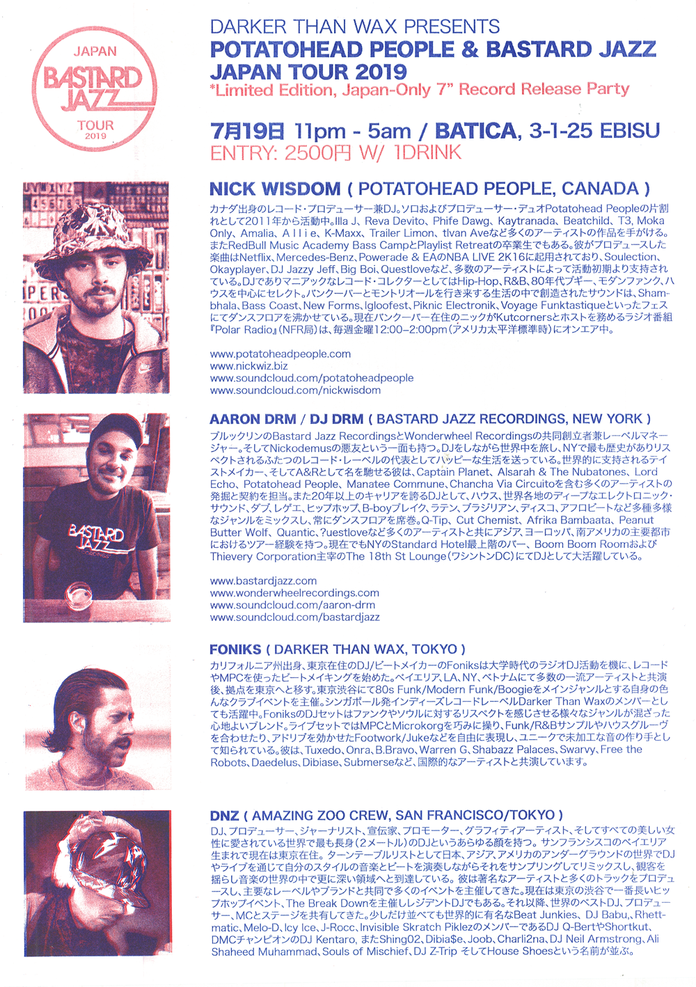
Potatohead People & Bastard Jazz Japan Tour 2019 Event Poster - front
In early spring of 2019, the head of Bastard Jazz, a boutique record label in New York, had inquired about some help with contacts for a summer tour of Japan that year, which quickly snowballed into me illustrating and designing these riso print posters, flipping their logo into a circular design with both English and Japanese katakana versions (which I had turned into a hanko stamp as well as printed on shirts for the tour), organizing events in Tokyo, Shizuoka and Osaka, contributing a song to the B-side of a limited-run white label 7” they pressed, and even joining the tour doing live and DJ sets.
The entire process was exciting, daunting, and incredibly gratifying to apply multiple skill sets to help the label and artist make their tour a reality. A LOT was learned, mistakes were made, and successes were had.
For the front illustration’s inspiration, I had looked at a ton of Japanese graphic artists from the 60s, 70s, and 80s. While the final product wasn’t meant to emulate those styles, I think it informed the image to a degree. The matchbox was based on an actual matchbox that I had saved from a sushi restaurant shortly after moving to Japan – proving that bit of ephemera to actually be useful, even if years after the fact. As with every project, there are some hiccups. Even though there was a mixup in my application of Showa-era katakana type layout/orientation, that was a valuable experience to learn from. Consequently, I now know to doubly confirm how locals will read anything I design that has incorporated hiragana/katakana (the two phonetic written character sets in Japanese). Mistakes lead to knowledge :)

Potatohead People & Bastard Jazz Japan Tour 2019 Poster - back
This is the backside of the Potatohead People & Bastard Jazz Japan Tour 2019 poster that I had designed and illustrated. I really enjoyed the process of riso printing these, thinking in terms of only the two colors available at Irregular Rhythm Asylum in Shinjuku San-chome. The subtle imperfections in registry were really interesting and gave a nice handmade feel to the posters. Check out the front for the illustration I made!

Black Flamingo Event Poster
An event poster that I illustrated and designed for a club night at Black Flamingo, a Brooklyn music club run by the acclaimed DJ/production duo Soul Clap. In typical suit, I wanted to make a poster that would go above and beyond the average flyer that most wouldn’t think twice about after seeing once. The DJ lineup are all seasoned selectors, garnering attention via radio shows on stations like Dublab, Lot Radio, NTS, and other outlets. I came up with the idea of some alien creature in its own psychedelic, fantasy realm playing music simply for the joy of it. I enjoyed working with a complimentary color scheme that was a bit more limited than other projects. Concept, illustration, and design by me.


Editorial Illustration for Metropolis Magazine, Tokyo
This was an editorial for one of Metropolis Magazine’s New Year’s editions. They were doing an article regarding the traditional end of year TV show, Kohaku (Red & White), which often features mainstay artists from past and preset who “compete” against each other in a series of performances. The article was musing on what would happen if current artists, like rising Japanese rapper, Kohh, were featured on such a family-friendly show. I ended up having the rapper’s tattoed hands and grill creeping out from under the blanket of the kotatsu, or classic Japanese winter heating table, ready to shake up the traditional New Year’s paradigm.

Editorial Illustration - Time Out Tokyo
This was a fun editorial illustration for Time Out Tokyo to be used in an article regarding food shows on TV. My contact thought it would be funny/interesting to have someone watching a food show while eating, so I got to work to make something that fit the bill. For people familiar with Japanese food culture, you might find it odd that someone would be eating ramen (one mindset) while watching a show with sushi (another mindset); they’re two dishes that don’t often exist under the same roof.


